



User-focused introductions to directional design
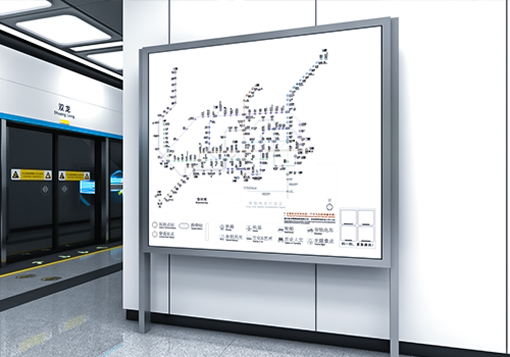
When a shopper arrives at a busy retail concourse or a transit interchange, the first impressions are spatial — not verbal. A user-centric approach places clear visual hierarchy, legibility and concise pictograms at the front of design decisions. Effective implementations often sit alongside broader systems, such as public transport signage, so that people moving between a bus stop and a store experience consistent cues rather than a fragmented set of instructions.
How pedestrians actually move: behaviour over aesthetics
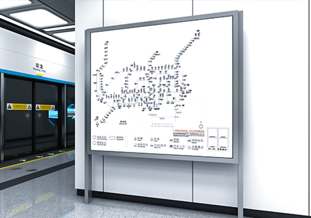
Field observation shows most travellers select routes by sightlines and concise information — the line-of-sight matters more than an ornate finish. Good custom-moulded signage respects flow: it orients users, marks decision points and reduces backtracking. In downtown hubs like Toronto’s Union Station, wayfinding upgrades that prioritise viewing angles and real-time information displays simplified transfer paths during peak hours, easing congestion and improving passenger confidence.
Design patterns that work for customers
Practical patterns repeat across sites. Use bold, high-contrast type for distance and direction; reserve pictograms for consistent actions (entrance, ticketing, lifts). Place decision signage before junctions rather than after them. Integrate tactile elements where compliance or accessibility requires it. These elements combine into a clearer system — and when routing needs to span retail aisles and transport forecourts, tie them together with unified colour coding and symbol sets that echo bus station wayfinding.
Common implementation mistakes and how to avoid them
Too often projects treat signage like decoration rather than infrastructure. Typical mistakes include overloading panels with text, inconsistent symbol libraries, and placing signs at inconsistent heights. Another frequent error is neglecting mounting geometry: a sign placed at a poor angle loses its legibility at pedestrian speed — designers should prototype sightlines on-site. Small pilot runs often expose these faults early — and save costly rework.
Material and production choices that matter
Custom-moulded panels let you shape form to flow. Durable substrates resist vandalism and weather; anti-glare finishes preserve contrast under varied lighting. Consider modular assemblies so maintenance and message updates are straightforward. For projects with digital integration, ensure real-time information displays blend with static orientation signage rather than fighting for attention.
Case-based thinking—what to test first
Start with three quick trials: wayfinding at the approach, at the node, and along the route. Measure time-to-decision and instances of backtracking. Small changes in placement or pictogram size can yield measurable drops in confusion. — Keep notes on the busiest hours and surface materials; these often change how signs read from a distance.

Comparisons and alternatives
Options range from inexpensive vinyl to bespoke moulded units. Vinyl can be fast and cheap but tends to degrade; bespoke moulded signs cost more initially but deliver clearer tactile presence and longevity in high-traffic areas. Digital totems add flexibility but require power, network maintenance and may distract if overused. The right mix depends on expected footfall, maintenance budget and integration needs with transport information systems.
Three golden rules for selecting signage solutions
1) Legibility-first: prioritise character height, contrast and mounting angle over decorative detail. 2) System continuity: match pictograms, colours and terminology across retail and transit edges so users experience a single coherent system. 3) Maintainability: choose materials and mounting systems that allow quick repairs and updates without full replacement.
Final thoughts and practical value
Design that centres the pedestrian reduces confusion, shortens journeys and improves dwell experiences for both shoppers and commuters. Measurable improvements follow when wayfinding combines ergonomic sightline testing, appropriate material choices and consistent symbol language. For projects bridging retail spaces and transit nodes, partnering with a signage specialist helps turn strategy into durable installations — Cosun Sign brings that blend of craft and system thinking to life. — Practical, proven, and built to last.

